Also, more commonly known as “Case Studies,” explained in Helvetica.
The Coffee House
Rebrand
My journey with The Coffee House project began with a genuine passion for coffee, sparked during my visits to the area and stops for coffee. Those visits exposed an opportunity for revitalization that couldn’t be ignored. This narrative extends beyond a mere visual overhaul; it delves into connecting with the local community’s heartbeat, resonating with a younger demographic, and embracing skateboard culture. This endeavor injected fresh energy into a beloved space, fusing design innovation, youthful charm, and a collective love for coffee.
Against the vibrant backdrop of Williamsburg’s dynamic atmosphere, The Coffee House set out on a transformative rebranding adventure. The spotlight was on the burgeoning community of young professionals who frequented the café. The aim was simple yet profound: craft an authentic image that genuinely spoke to this audience while preserving the café’s core commitment to serving quality coffee and leave room for expansion in further projects to incorporate the in house roasted beans.
The Brand
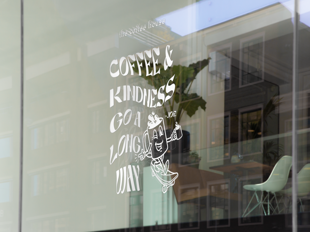
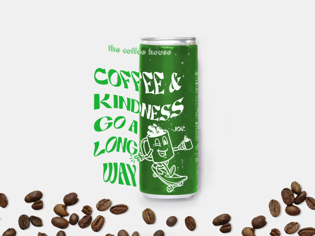
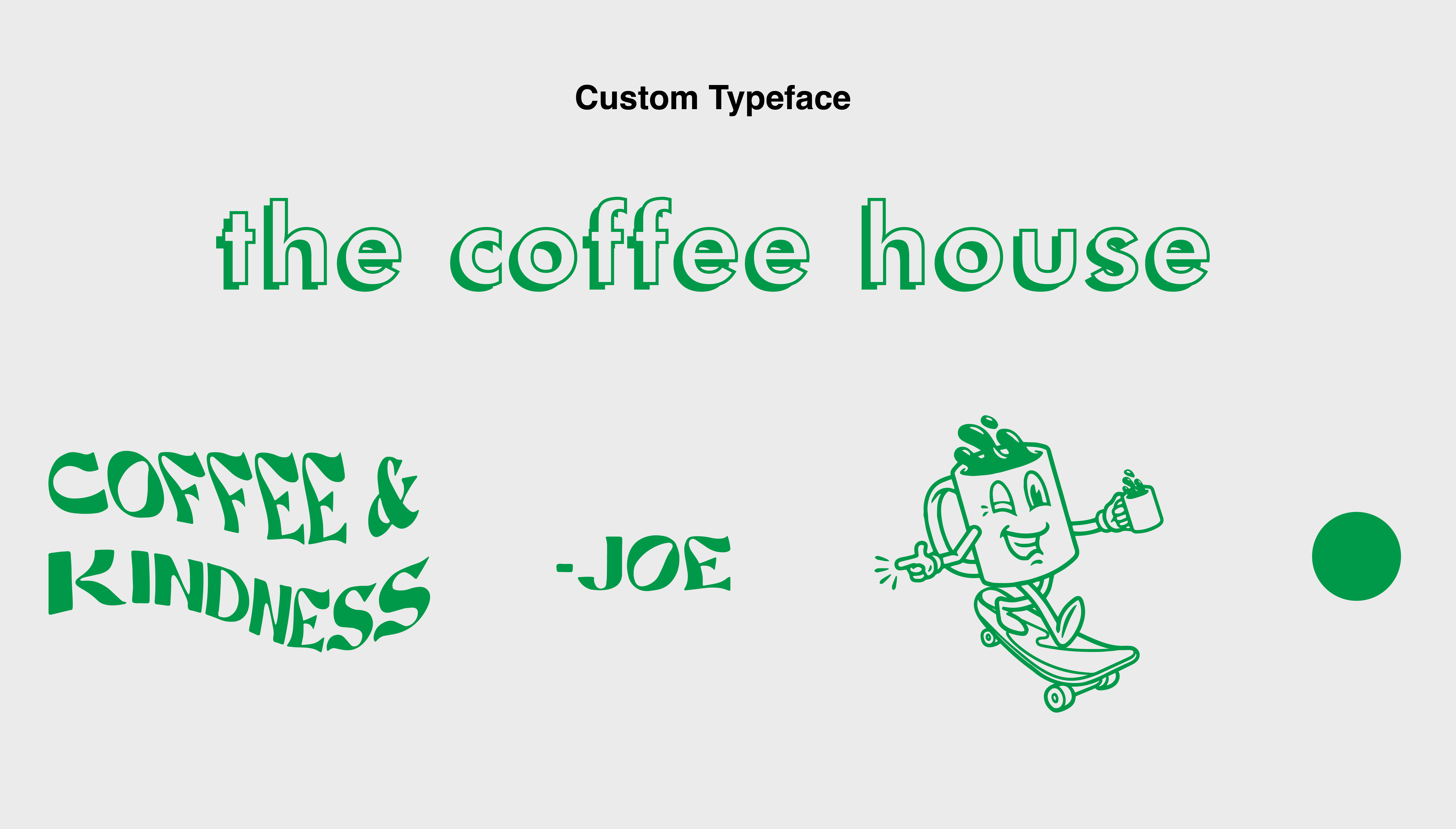
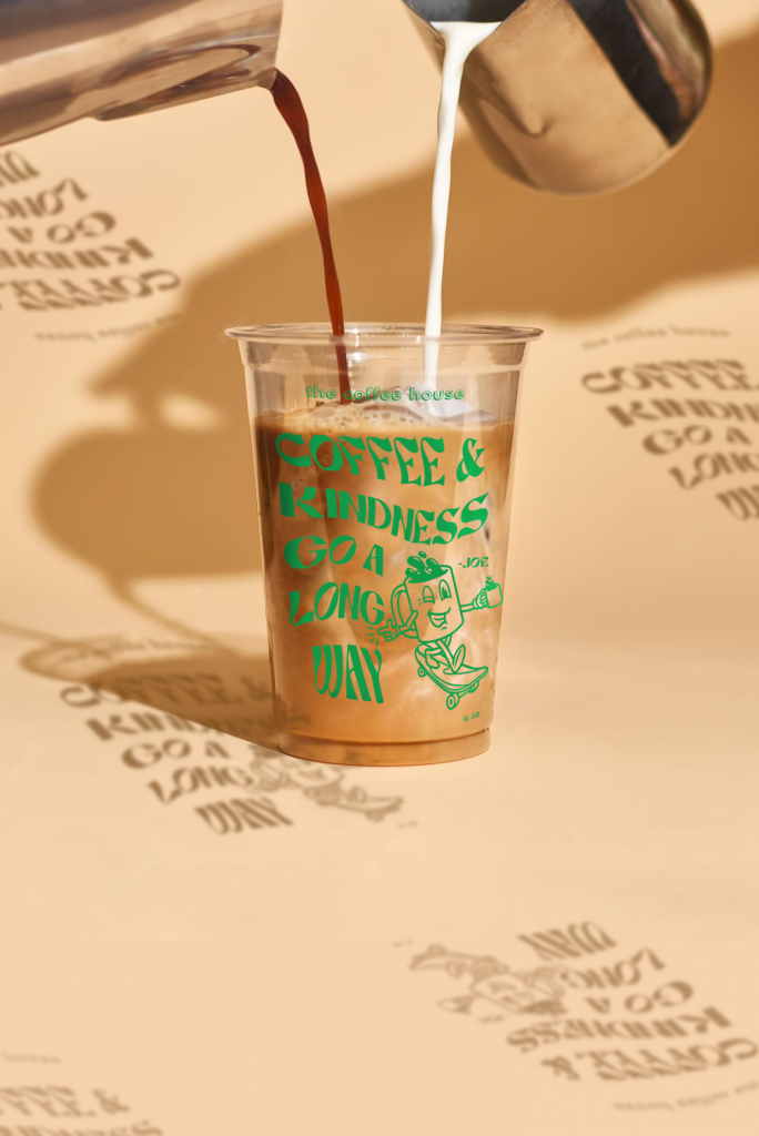
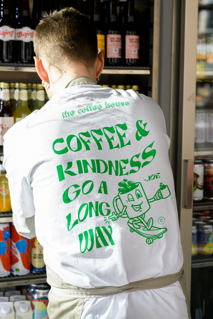
The Logo
A pivotal point in my rebranding journey was crafting the logo that would encapsulate the café’s rejuvenated identity. Recognizing the design that perfectly embodied the café’s essence, I presented it to the owners for approval. The objective was to infuse the vibrancy of skateboard culture with the aspirations of young professionals, culminating in a logo that seamlessly represented both. To give uniqueness and relevance to the design I crafted a custom typeface and character for patrons to love and relate to. My color choice of green was a subconscious play on the fact that The Coffee House has always roasted their own beans, right at the front of the store entry. Other materials are being developed still.
Project Impact
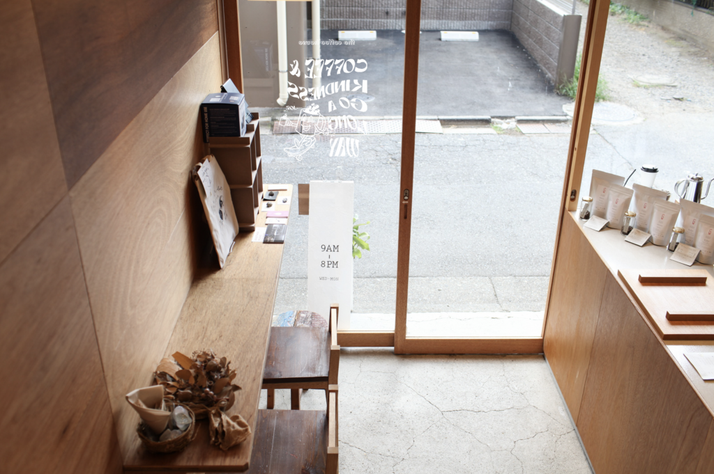
This rebranding journey went beyond surface-level changes, leaving a lasting impact. The café’s Google rating soared to an impressive 4.5, a testament to its resonance with the younger demographic and the undeniable success of the rebranding endeavor. The café transformed into a haven where young professionals discovered an environment that resonated with their aspirations and taste.
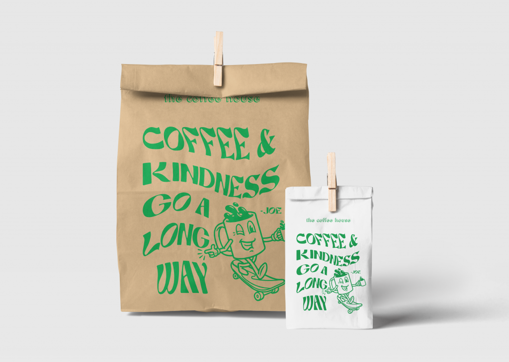
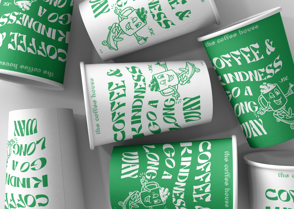
Thankfully the brand is an ongoing evolution with room for products and merchandise, all offered locally within the location only. The café gracefully adapts to the ebb and flow of Williamsburg’s culture, embodying a commitment to design excellence, community engagement, and an unwavering passion for crafting the perfect cup of coffee. A testament to this transformation, The Coffeehouse proudly stands at #4 among over 300 local coffee shops.
Packaging and Brand
Outcome and Opinion
In my view, this case study underlines the transformative influence of purposeful design on an enthusiastic audience. It exemplifies the art of crafting environments that embody the essence of the community and its individuals. The rebranding of The Coffee House stands as a harmonious amalgamation of coffee, culture, and connection – a fusion that not only makes a lasting impression but also propels ongoing evolution and inspiration.
The rebranding of The Coffee House has had a profound impact, showcasing the tangible results of thoughtful design. It has successfully shaped spaces that resonate with the local community and its unique spirit. The reimagined identity of The Coffee House serves as a dynamic blend of coffee, culture, and camaraderie. This fusion has left an indelible mark and continues to evolve, inspiring both its patrons and its journey of growth.